Monday, 3 May 2010

Evaluation: How did you use new media technologies in the construction and research, planning and evaluation stages?

For my media coursework i learnt a lot of new skills. For example, learning how to use this blog! Blogging is something i've never done before, so this in itself was a challenge.

As shown in my blog, i've also used a lot of print screens, something which i learnt during the process and have used it to show examples of my work along the way.

I used photo editing software such as photoshop and picasa to edit and adjust photos to make them clearer


I also experimented with my photography and tried a more artistic approach for some photos:


This worked well and audience feedback suggested that it could represent lonliness etc, something that i was aiming for because it is my main image for my front page of my newspaper.

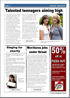
For my As media coursework i used microsoft word, my final music magazine therefore looked very amateur, i wanted to make my newspaper this year look better quality and therefore used microsoft publisher and learnt how to add guidelines to make it look like a proper newspaper with colums etc.

Here is an example of how my technical ability has improved from last year:


One thing that proved vital in my research stages was the internet, it meant that i could look at local newspapers from around the country online and get a wider view of what local newspapers are like.

Here are some of the websites i looked at:
http://www.hampshirechronicle.co.uk/
http://www.surreyherald.co.uk/
http://www.somersetcountygazette.co.uk/
http://www.theargus.co.uk/news/

I also looked at the websites for the two isle of wight newspapers:
http://www.iwcp.co.uk/
http://iwgazette.biz/

Another element to my coursework was my radio advert. I've never recorded anything before so this was a challenge too. i tried various methods but decided on using my microphone on my laptop. I also used a website called www.freeplaymusic.com which has lots of uncopyrighted music on. I downloaded this and added it to my advert which i then burnt onto a disc.


When researching radio adverts, i of course, listened to the radio, however i found www.youtube.com useful as it meant i could listen to adverts over and over again so that i could analyse them properly.


For my radio advert, i needed to put it into a video format in order for it to work properly on my blog. I therefore used windows live movie maker to make a video. I added an image of a title page and clicked 'add music' to add my video on.


I then had to create a youtube account and load it onto youtube


Finally, the use of blogs has worked well. A lot of my peers also have blogs so it is a quick and easy way of accessing eachothers work from our own homes. It has proved very useful as they can just look at my blog instead of me carrying around surveys for people to fill out.

Sunday, 2 May 2010

Evaluation: What have you learned from your audience feedback?

I found that in this piece, audience was the key thing which helped me make my decisions.

I wanted to use people from my target market (teenagers) to have their say in what they would like to see in a newspaper and what they think would be most effective.

I originally had a very general target market: adults, however feedback on my blog suggested it would be a good idea to focus on a smaller group, which is why i changed it to teenagers.


I carried out various questionairres to find out the views of my target market about things such as price, content and title. From this i learned that most people would pay 70p for their paper, therefore my paper is 70p

It also helped me decide on a title:


And as the third person said, there was potential in this for a good logo and i then set about creating a logo which looked vaguely like an eye.

I wanted to include my target market in all areas of my production so i also got comments on which pictures to use, this comment was particularly helpful:


One person suggested to have a series of posters so then i could get people to say which they preferred:


i took this on board and created three posters


I did a survey aswell as looking at feedback from my blog and it was decided that the second one was best due to a number of reasons


I also used the ideas of my peers (also my target market) to make decisions on my radio advert, i carried out a survey and went with the majority vote, i also listened to my actors views and their ideas when they were rehearsing they felt that there should be less dialogue and more music, i changed it and felt that this was better.

Audience feedback has been vital for my coursework as my target market has made most big decisions, sometimes unexpected ones (e.g. the choice of radio ad) therefore i am thankful as i would have ended up with something that my target audience isn't attracted to.

Feedback has helped me better my piece and made me sure that it is right for my target market.

Evaluation: How effective is the combination of your main product and ancillary texts?

When producing my coursework i wanted all three tasks to link well with eachother so that it is clear that they are all associated with eachother. For example, with my front cover and my poster, i kept the title and logo the same to show to my audience that they are clearly linked.


I also made sure each thing was very relevant to the Isle of Wight itself, seeing as it is a local newspaper for the Isle of Wight. When thinking about how best to advertise, i thought about the beach as it is the main tourist attraction and beautiful place on the island. It's also a place where a lot of young people go.

With this idea i took a lot of my photos for my poster on the beach


I also made sure i made reference to the Isle of Wight in my radio ad.

I used the same fonts in both my poster and my newspaper as they are printed media and i used the newspapers website in both. A catchphrase i used in my poster 'The Islands new local newspaper for teenagers' was also used in my radio advert as the slogan.

I feel all three worked well effectively to produce my local newspaper in a way that my audience would be able to see the link between the radio ad and the poster and work out that it all links in with the newspaper.

Evaluation: In what ways does your media product use, develop or challenge forms and conventions of real media products?

I wanted to use existing conventions of newspapers so that it was recognisable to my audience as a local newspaper, some of the conventions i used was:

Masthead - My title 'Island Eye' ran along the top like most local newspapers
Date/price/website/ - normal conventions that need to be on a newspaper
Articles with supporting images - Most local papers use images to enhance the stories etc.

I wanted to write in a similar style to normal newspaper articles, i therefore looked at various examples of existing newspapers such as 'The Isle of Wight County Press' and copied their style of writing, i also used it to find good topics for stories for me to cover.


I also created my paper for a specific target market (teenagers) therefore in the same way that the county press aim their adverts more to the elderly, i aimed mine at teenagers advertising for things such as driving instructors and pizza hut etc.


However. In order for my paper to stand out and be different to most local newspapers i needed to challenge the usual conventions and produce something different.

I decided to use a colour scheme of blue. This isn't a common thing in newspapers, apart from in logo's. I chose blue as it is a colour which appeals to both boys and girls and also represents the sea - one of the great assets of the Isle of Wight. I used the colour scheme in my title, logo, contents and also kept the theme on the second page by having a band of blue across the top.

In my research i didn't come across any local newspapers which are aimed at teenagers. This alone is therefore challenging conventions. I made sure i made my target market clear by using teenage models in my poster and teenagers actors to do the voices in my radio ad.

here are some of the teenagers i used:

Final Pieces

Here is my final Front cover, 1st page of my newspaper and poster for my newspaper:


here is my radio ad:


Thursday, 29 April 2010

Radio Advert

I have now recorded my radio advert but can't find a way of getting it onto here at the moment.

I chose 3 A level drama students to do the voices for my advert so that they could get the right type of expressions i was looking for.

I wanted to use boys and girls to show that my newspaper is aimed at both and made sure they were of the same age as my target market.

After a couple of practices we decided that the advert was too long so we shortened the dialogue and made it faster. My peers also liked the music at the end but felt there should be some at the beginning so we did that. This shows the importance of audience feedback when making my radio ad.

Tuesday, 27 April 2010

Photo Editing

Here is an example of how i edited a photo to make it look clearer and better quality.

This is the original:


and this is the edited version:


i cropped it so that it would fit better on my newspaper page and i also enhanced the colours to make it brighter and clearer.